

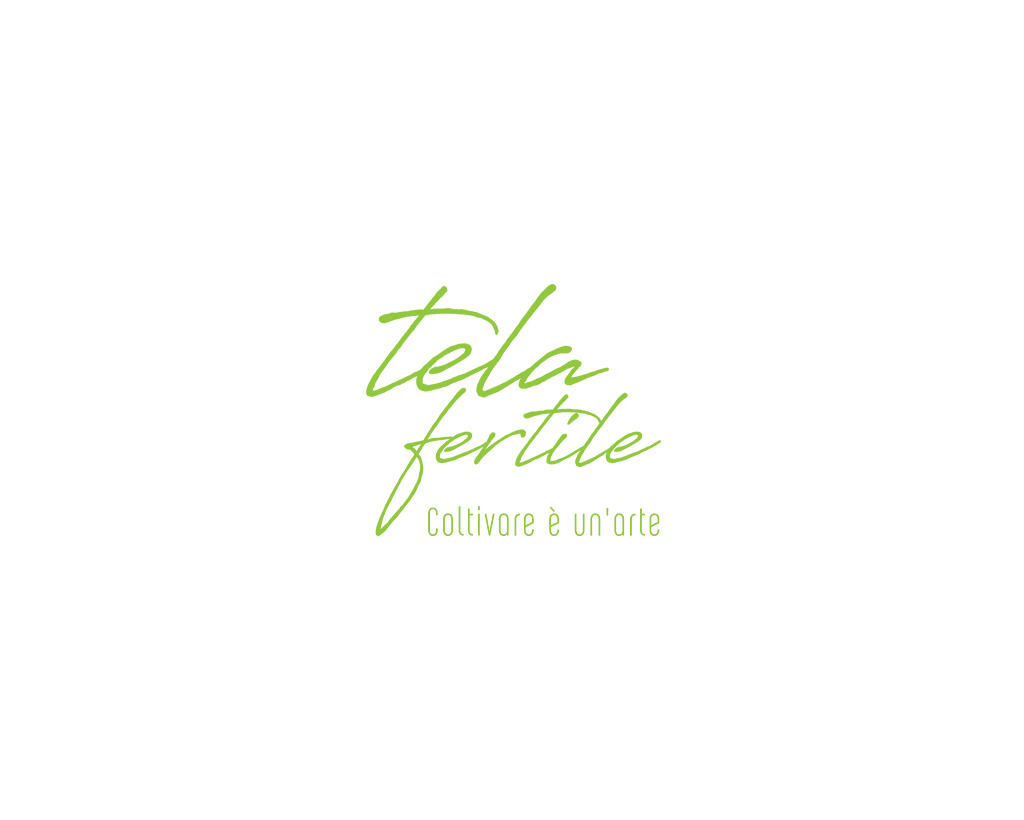
Tela Fertile
Sardinia, Italy
Prev
 0
0
Cesare Paciotti – Home Furniture
18 July 2022
Next
 0
0
Essenza Bistrot – Italian Restaurant
09 April 2023
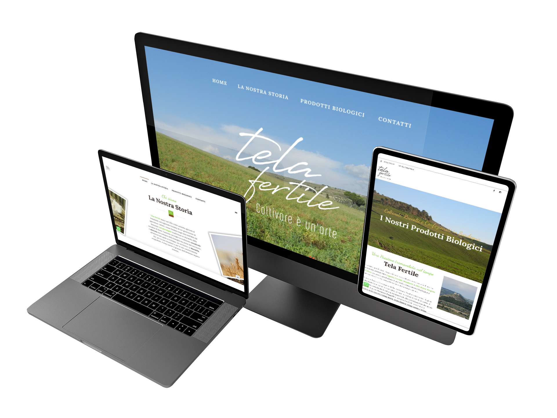
Client Description
Tela Fertile, a Bio Food Company contacted us for a little rebranding. They needed brand guidelines to follow to increase their presence in the market. During several meetings, we decided together to create a new #BrandIdentity and set up a new logo strategy and new packaging ( in progress at this time ).
Logo: We maintain the previous one Calligraphic Hand made Font, useful for guaranteeing credibility and trust in the Bio Products. We changed colours palette and provided the Client with a “guide”:- Gridded Logo
- Logo Mark
- Palette and Shades Colors
- New Font and Web Font to be used
- Samples of Merchandising
Info